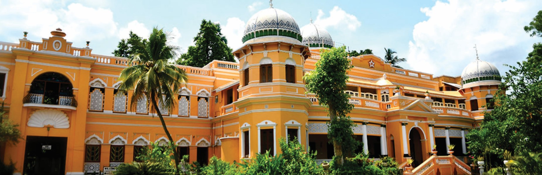
KOLKATA
Lorem ipsum Lorem Ipsum is simply dummy text of the printing and typesetting industry. Lorem Ipsum has been the industry's standard dummy text ever since the 1500s, when an unknown printer took a galley of type and scrambled it to make a type specimen book. It has survived not only five centuries, but also the leap into electronic typesetting, remaining essentially unchanged. It was popularised in the 1960s with the release of Letraset sheets containing Lorem Ipsum passages, and more recently with desktop publishing software like Aldus PageMaker including.
Lorem ipsum Lorem Ipsum is simply dummy text of the printing and typesetting industry. Lorem Ipsum has been the industry's standard dummy text ever since the 1500s, when an unknown printer took a galley of type and scrambled it to make a type specimen book. It has survived not only five centuries, but also the leap into electronic typesetting, remaining essentially unchanged. It was popularised in the 1960s with the release of Letraset sheets containing Lorem Ipsum passages, and more recently with desktop publishing software like Aldus PageMaker including versions of Lorem Ipsum.
Lorem ipsum Lorem Ipsum is simply dummy text of the printing and typesetting industry. Lorem Ipsum has been the industry's standard dummy text ever since the 1500s, when an unknown printer took a galley of type and scrambled it to make a type specimen book. It has survived not only five centuries, but also the leap into electronic typesetting, remaining essentially unchanged. It was popularised in the 1960s with the release of Letraset sheets
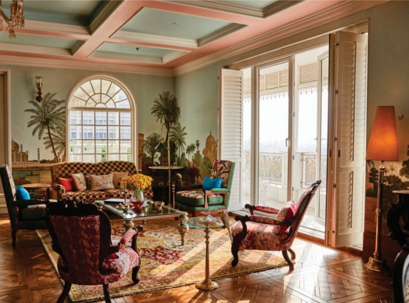
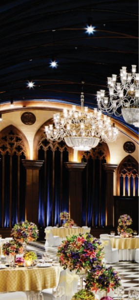
Colonnades rise with a kind of certainty you rarely see now. Greek in proportion, Roman in confidence, softened by French detailing. Ceilings are painted, not just finished. Mirrors stretch space until it feels theatrical. The Sheesh Mahal fractures light into smaller, shimmering fragments. Every surface is deliberate, but nothing feels restrained. It is excess held together by symmetry.
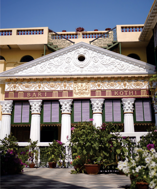
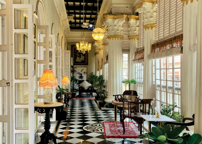
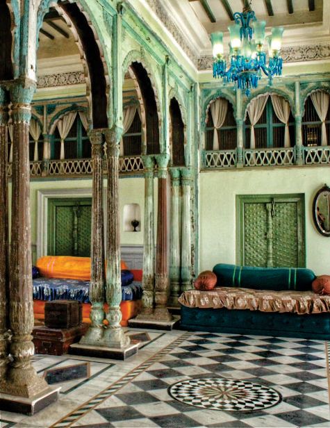
Here, design behaves like memory. One room carries the weight of a tailor, another echoes theatre, another stitches together the rhythm of typing. Tools become decor. Walls hold prints; shelves hold stories. The Victorian layer appears quietly, in the look of bathroom fittings, buggy lamps, and a certain color order. It is not staged; it feels accumulated.
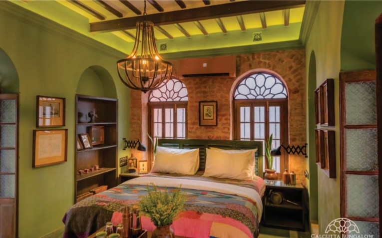
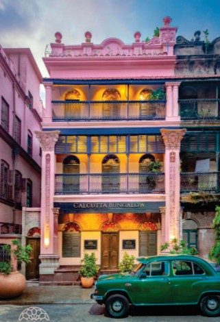
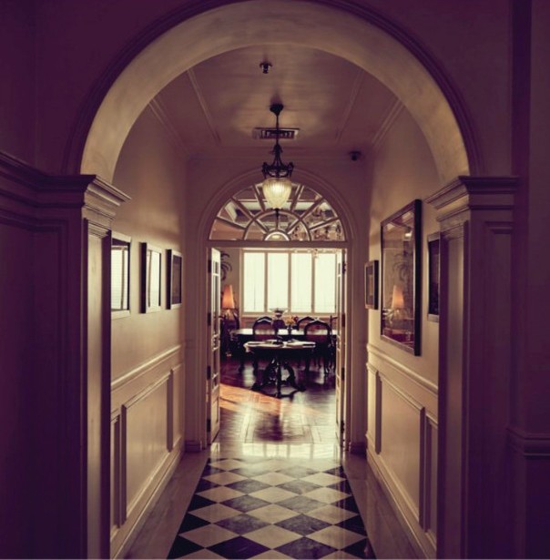
Panels take over where heavy Victorian stone once dominated. Celadon, pale yellow, muted pink. Detail is bone-remain colonial. Marble floors cool the spaces. Carpets soften movement. Hallways are along and, almost processional. Art fills the walls, not as decoration, but as continuity.
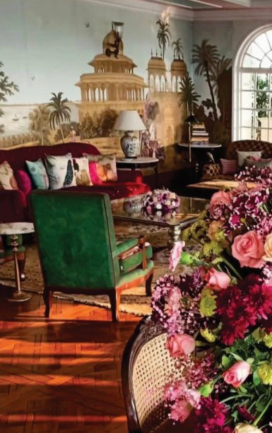
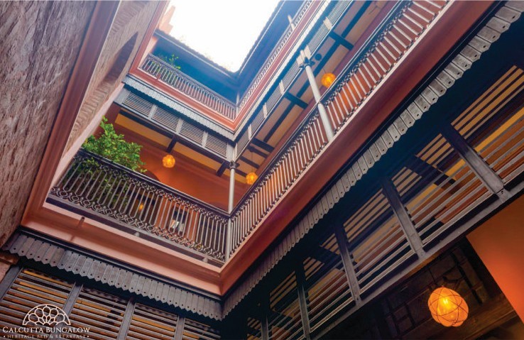
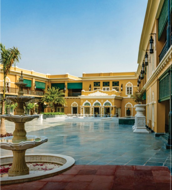
Courtyard remains the entire experience. Open to the sky, yet enclosed by rhythm. Arches borrow from Indo-Saracenic vocabulary, while details remain distinctly Bengali. Hand-pulled fans, carved railings, a polar ruin placed not as an object but as presence. It feels commercial without trying too hard.
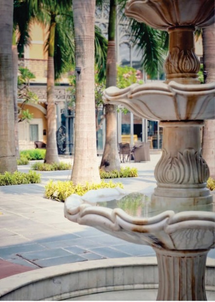
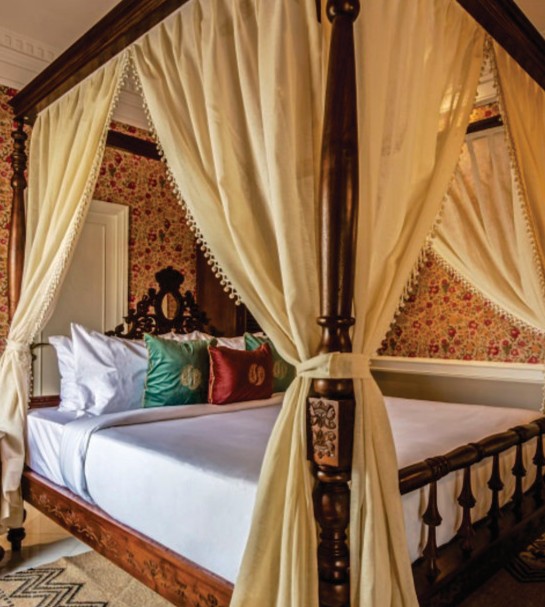
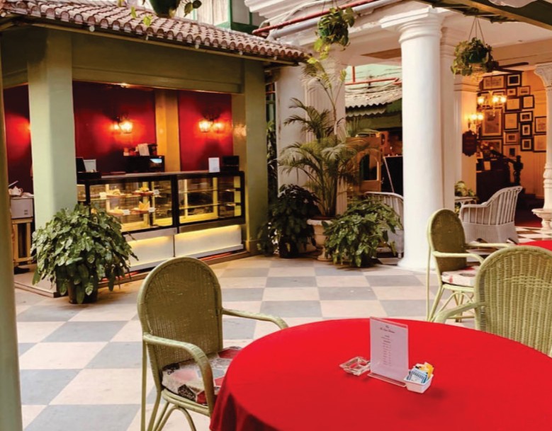
High ceilings, deep verandas, furniture that carries the weight of use. Nothing matches, yet everything belongs. Memorabilia sits alongside polished wood. The Victorian influence is not in any one piece, but in the way the space holds together.
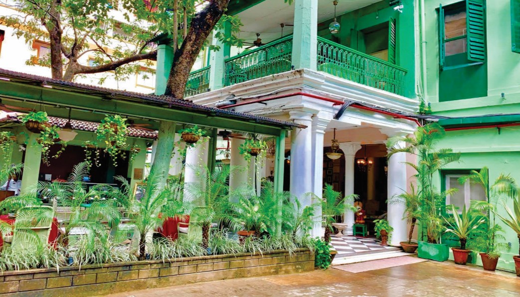
Pointed arches meet local material. The structure leans into Gothic drama, but the climate softens it. Verandahs widen, openings expand. The result is less severe, more breathable.